Responsive web design is a future-friendly tool for websites, having three principles. Media Query, Flexible Grid and Flexible Media. Flexible grid is not hard to achieve just set an container element in percentage and linearized the element in small devices, text can be resized and flow in smaller and higher resolution but when think of media (this post focusing image only), There are different ways of making images flexible in responsive web design and images are inserted in an HTML page as ‘img src‘ and ‘CSS background‘.
From fixed to proportional width images
 First hurdle in flexible image for responsive web design is fixed width of image, in a simple solution just assign the ‘max-width:100%‘ and ‘height:auto‘ to the image. This makes the image to scale up to 100 percent of their containing element and that element should be in percentage, only then.. image can be proper flexible for all resolutions.
A simple formula for converting a fixed width to percentage is.
target ÷ context = result
For instance: Image width is 800px Parent container width is 1366px
800 ÷ 1366 = 0.585651…
|
1 2 3 4 5 6 |
figure { width: 58%; } figure img {max-width: 100%; height: auto;} <figure> <img src=”sample-img.png” /> </figure> |
From proportional to fixed images – Scenario
Using the proportional width, images will scale as the viewport expands and contracts. But if the image expands beyond its native size, it will look ugly as scaling up an image beyond its native size will degrade (pixelate) the image quality.
 For instance: In the above mentioned example 58 percent width of figure is calculated by dividing (width of image) and (parent container width). Now, what if the parent container width is not fixed, and we don’t know the maximum width. It may go beyond the 1366px, it may be viewed in 1900px resolution. This will result to take the image beyond its native width and degrade the image quality.
Solution: Assign the width in percentage and max-width in fixed value.
|
1 2 3 4 5 6 |
figure { width: 58%; max-width: 800px; } figure img {max-width: 100%; height: auto;} <figure> <img src=”sample-img.png” /> </figure> |
Flexible image using the CSS background
CSS properties that play the vital role to make images flexible in responsive web design are ‘background-size‘ and ‘background-position‘.Both of these property are used to make an image responsive for different resolution and both provide the different output.
Flexible images using the background-size property
Just set the ‘background-size:100% auto‘, that scale up or down the background image as per the containing element. Here, 100% is the width and auto is the height.
|
1 2 3 4 5 6 7 8 9 10 11 12 13 14 15 16 17 18 |
/* high resolution */ .background-container { width: 460px; height: 285px; background-image: url(scenery.png); background-repeat: no-repeat; background-size: 100% auto; } /* medium resolution */ .background-container { background-size: 70% auto; } /* small resolution */ .background-container { background-size: 50% auto; } |
Crop images using the background-position property
 Image can be cropped by using the ‘background-position‘ and set the most important part of the image before scaling it down.
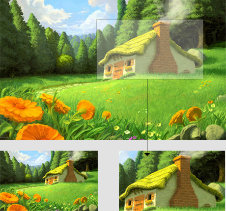
For instance: An image with dimension 460×285, need to be displayed in iphone portrait resolution but by showing the detailed area of image and cropping the rest area, rather than scaling it down. Set the focal point of image by using the negative value ‘background-position‘. Let’s say it is -200px from left and -85px from top.
Now reduce the actual width 460 – 200 = 260px and height 285 – 85 = 200px
|
1 2 3 4 5 6 7 8 9 10 11 12 13 14 |
/* high resolution */ .background-container { width: 460px; height: 285px; background-image: url(scenery.png); background-repeat: no-repeat; } /* small resolution */ .background-container { background-position: -200px -85px; width: 260px; /* 460 - 200 */ height: 200px; /* 285 - 85*/ } |
Cropping of image in responsive web design
Images in responsive web design can be cropped using the css ‘background-position‘ as mentioned above and same technique can be used to crop the ‘img src‘ by using the negative margin in place of ‘background-position‘. To deal with cropping images in responsive web design, a Focal Point CSS framework has been created by Adam Bradley a GitHub project, that can be used to crop the responsive images.
Summary
There are two ways of inserting image in an HTML page – ‘img src‘ and ‘CSS background
- In responsive image first role is played by proportional width of an image, that can be calculated by very simple formula ‘target ÷ context = result‘.
- ‘max-width:100%‘ with proportional width of parent container is used to make ‘img src‘ flexible.
- CSS background image can be made flexible by using ‘background-size‘.
- Image can be cropped, by using the negative value ‘background-position‘ for CSS background and negative value margin for ‘img src‘
Thanks for the great information on your site! I’m new at web design and appreciate all the tips/tricks and short cuts.
Thanks,
Joseph