Desktop browser and mobile browser are not the same. There is no window, scrollbar, resizing option in the mobile browser. User flick, pinch and zoom in mobile browser, and these gestures are not there in the desktop browsers. Because of these interaction differences, viewport on the desktop and mobile are not same.
Why viewport is important for mobile browser
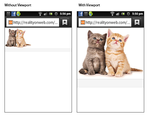 In any responsive web design project, applying viewport is the first and most important step, that make a web page presentable in the mobile browsers. Viewport controls how a web page will display on a mobile device. If the viewport is not applied, mobile device will render the page at a typical desktop screen width, scaled to fit the screen. That force users to zoom before they can interact with the page.
Meta viewport tag
We get control over the page’s width and scaling on different devices by setting the viewport. Meta viewport gives the instruction to browser, on how to control page’s width and scaling. It actually override the browser’s default behavior.
|
1 |
<meta name='viewport' content='width=device-width, initial-scale=1.0' /> |
Fixed width viewport and responsive viewport
Viewport width can be set as fixed or responsive width. Specifying fixed pixels content = ‘width=320’ means the page won’t appear properly on wider devices. And responsive viewport value like content = ‘width=device-width’ will instruct the page to match the screen’s width and reflow content to match the different screen sizes.
Portrait to landscape mode zoom – initial-scale
Browser like iOS and window phone, keep the page’s width constant when rotating to landscape mode. It actually, zoom rather than reflow to fill the content. Attribute initial-scale=1 allow the page to take full advantage of the full landscape width.
Mobile zooming control – user-scalable, minimum-scale, maximum-scale
It is possible to control the zooming of the viewport by setting minimum, maximum zoom or completely disable the zoom by using the attributes – minimum-scale, maximum-scale, user-scalable
|
1 |
<meta name='viewport' content='width=device-width, initial-scale=1.0, user-scalable=no' /> |
zooming control attributes like user-scalable, minimum-scale, maximum scale should be avoided as it negatively impact accessibility
Some meta viewport related resources
- Apple iOS – Configuring Viewport
- Google – Configure the viewport
- The mobile viewport and orientation
Also don’t forget the css viewport declaration to support MS surface and certain versions of opera mobile. (Ironically the meta viewport tag is non-standards compliant, which Microsoft’s css declaration is)
@-ms-viewport { width: device-width; }
@viewport { width: device-width; }
http://wdbp.net/documentation/viewport-meta-tag-and-at-viewport-css-rule/
Also ios does not change device width when it portrait. So this won’t look right if the user tilts to portrait in ios.