![]()
As a requirement comes up to create an icon, Photoshop or Illustrator pops-up immediately in mind. Making any changes in icon like changing style, size or color open the photoshop again and do the required changes. And if the required icon need to be used in a web apps for iPhone 4s and iPad 3, will consume high bandwidth as it should be retina-ready and to make it retina-ready high resolution images will be used. But there is option to create retina-ready icons using CSS only where same code can be used for regular and retina display.
Make a canvas to draw icon on it
Here canvas is not the actual canvas but defining an area to draw the icon. Whatever the size can be used here. I am starting here 16×16 standard size for icons.
|
1 2 |
/* div with icon class will act as canvas to draw icon */ .icon { height: 16px; width: 16px; margin: 20px; position: relative;} |
Now the canvas is ready to play where position is chosen relative. So, that designer can place the icons element absolutely on the required position.
Start drawing an icon with CSS
Every elements within the div with ‘icon class’ will be set as position absolute. Now, the different shapes are required to place on the canvas. Many shapes can be created using CSS only. Let’s start with the basic circle shape.
|
1 2 |
/* All the element with absolute position*/ .icon * {position: absolute;} |
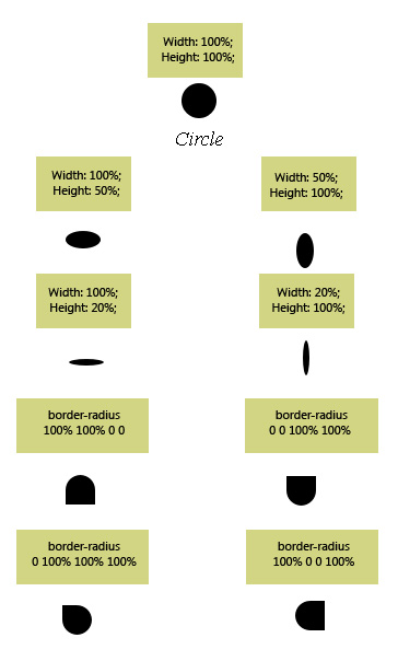
Create a circle shape

CSS property ‘border-radius’ plays a major role to draw any shape. Therefore, the browser that do not support border-radius property, will not be supported. If border-radius: 50% is given to a same height width container will create a circle shape.
Now, many shapes can be created with this circle by changing the height, width and border-radius
|
1 2 |
/* Draw a circle */ .cirlce {background: #000; height: 100%; width: 100; border-radius: 50%;} |
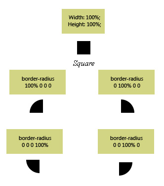
Play with square shape

Assign the height and width 100% to a child element of div with ‘icon’ class. It will create a square shape as parent have 16×16 dimension.
Furthermore shapes can be created by changing the height, width and border-radius property.
Play with triangle shape

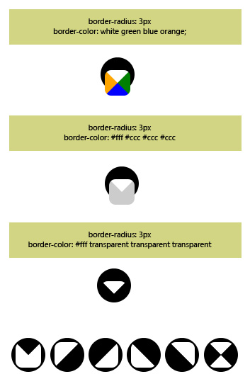
A lot more shapes can be created by using the border-radius and border-color property. Transparent border-color will play a major role to create a triangle shape.
|
1 2 3 |
/* Down arrow css*/ .tri {border-style: solid; border-width: 6px; border-radius: 3px; left: 15%; top: 35%;} .triangle1 {border-color: #fff transparent transparent transparent; } |
Now we are ready to create retina-ready css icons
Height, width, border-radius and border-color, these four properties play major role to create retina-ready css icon. I have created a few general icons that can be used for the reference.
Open the retina-ready CSS based icons file and start playing with it more. Best of Luck !!!
Or you can use this CSS for quick reference
|
1 2 3 4 5 6 7 8 9 10 11 12 13 14 15 |
/*Just for quick CSS reference*/ .icon-set {overflow: hidden;} .icon-set .icon {float: left;} .icon{width: 16px; height: 16px; margin: 20px; position: relative;} .icon * {position: absolute;} .icon em {top: 20px; font-size: 0.6em; width: 40px; text-align:center; left: -12px;} .circle {background: #000; border-radius: 50%; width: 100%; height: 100%;} .dot {background: #fff; width: 6px; height: 6px; border-radius: 50%; top: 50%; left: 50%; margin: -3px 0px 0px -3px;} .minus {width: 10px; height: 2px; background: #fff; top: 50%; left: 50%; margin: -1px 0px 0px -5px; border-radius: 30%;} .plus {background: #fff; width: 2px; height: 10px; top: 50%; left: 50%; margin: -5px 0px 0px -1px; border-radius: 30%; } .tri {border-style: solid; border-width: 6px; border-radius: 3px; left: 15%; top: 35%;} .triangle1 {border-color: #fff transparent transparent transparent; } .triangle2 {border-color: transparent #fff transparent transparent; left: -2px; top: 2px;} .triangle3 {border-color: transparent transparent #fff transparent; top: -2px;} .triangle4 {border-color: transparent transparent transparent #fff; left: 6px; top: 2px;} |
I like it, just make sure to have a plan b for old and not advanced device. Thanks for share!
Nice trick, I must say. But I rather trust on the freedom of SVG icons which can be used without CSS trickery
I thought you need to create a separate set of icons for retina with the size is double or triple the normal icon, then you need to use CSS media query or jquery to display different icons for different screen resolutions.
Not really useful imo… All the CSS code involved here will probably weigh more than the .png files, and all the elements and css-tricks will cost in performance.
Why not just use SVG icons or icon-fonts?
Font-Awesome is a library I always keep in arm’s length.